While watching The Mitchells vs. the Machines, I was reminded of a recent trend in animated movies, which is the growing need to make environments look realistic. Technology has increased to the point that animation can almost appear photorealistic. Even if an animated film has characters with exaggerated features, the “realness” of the rest of the film’s production design is often touted as a selling point. Both Walt Disney Animation Studios’ Raya and the Last Dragon and Pixar’s Toy Story 4 leaned into a grounded aesthetic, and many others wear “realism” as a badge of pride in their animation.
It should be said there’s nothing wrong with realism, but the focus on this style by many has severely restrained what animation can do. Disney can pour millions into making the CGI of The Lion King look so real it can be called “live-action,” but the great thing about animation is that it can be anything.
Spider-Man: Into the Spider-Verse was a fantastic example of what animation can do with its stylized look, pushing what animation is capable of. That film expanded the boundaries in terms of how a film can be animated. Now Netflix’s The Mitchells vs. the Machines is a high-energy exploration of the ground Spider-Verse broke.
That shouldn’t be an entire surprise. The team behind Spider-Verse (including producers Phil Lord and Chris Miller) have taken what they learned there and applied it to Mitchells. Spider-Verse was of course as much an experience as an animated movie, but Mithcells builds off that without the constraints of being tied to a well-established franchise.
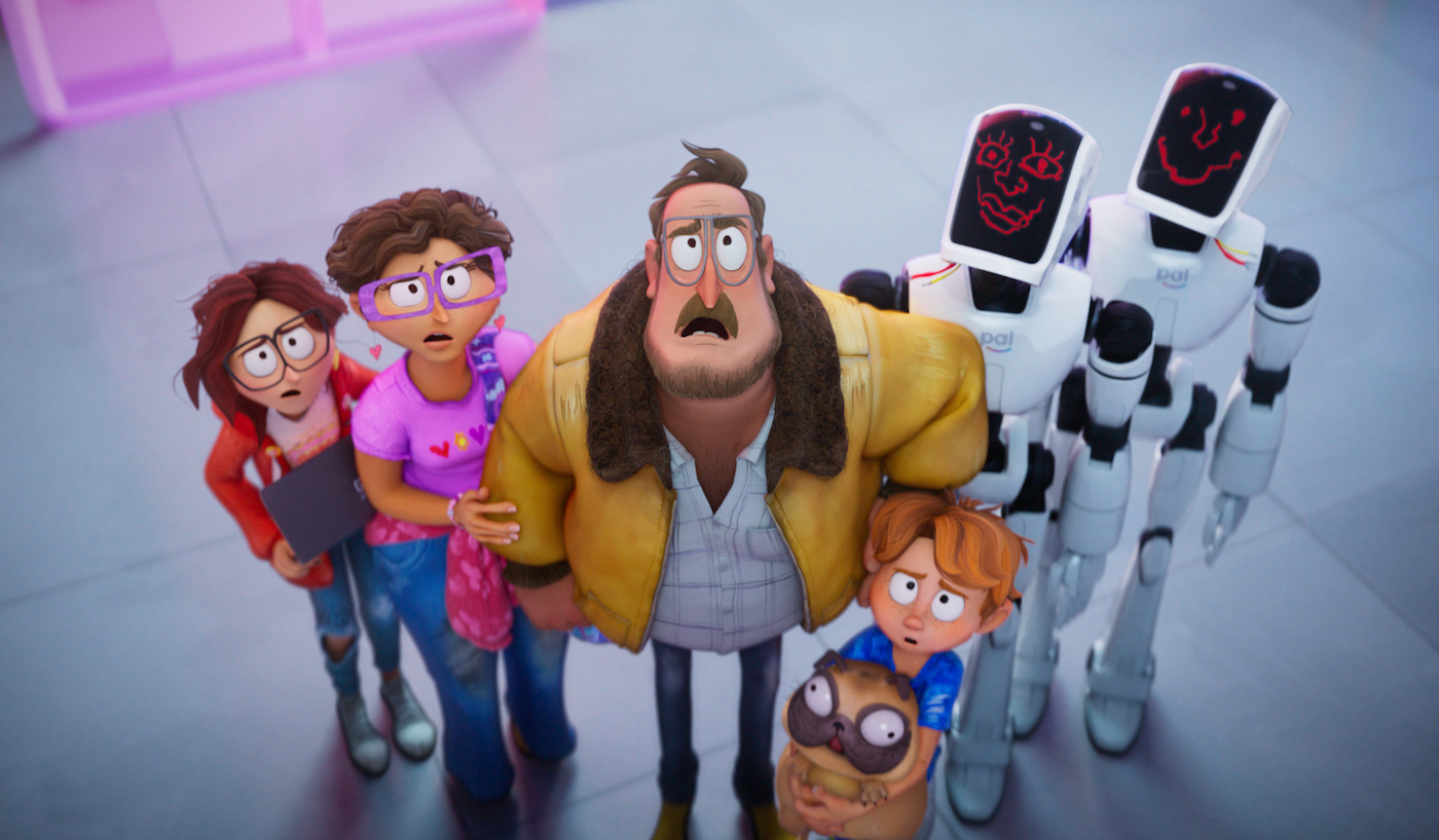
Quite simply, one of the many reasons The Mitchells vs. the Machines works so well is because it doesn’t bother to “look” real. It knows it’s an animated film and plays it up. This isn’t just seen in the backgrounds or character designs, but it’s in the very energy of the film. Instead of scenes playing out like you might see in live-action, Mitchells makes heavy use of on screen text, graphics, and even two-dimensional animation.
At first, all of this style seems contained within the films made by lead character Katie, who’s getting prepped to leave for film school in LA. Her wacky and zany films (one called “Dog Cop” is a particular highlight) make use of various kinds of animation and help to set -p her personality.
However, as the film goes, it throws in as much off-the-wall animation as it can. When Katie’s father, Rick, decides to drive her across the country to college along with the rest of the family, clouds form over Katie’s head but they’re made to look like a marker drawing. And when the robotic apocalypse begins, and the titular titular machines attack, Katie comes up with a plan to save humanity. The inside of her notebook not only keeps the marker look of the cloud from earlier, but we also see 2D animation of her family as Mad Max style warriors. The film even uses live-action mixed with the 3D animation.
The way the film mixes so many styles and aesthetics is a breath of fresh air. You can feel the team behind it having so much fun just tossing in whatever style would make a certain scene work. The main bulk of the movie is 3D, but it has enough other kinds of animation to really make it something unique.
The film also delights in color. Whereas many films these days (both animation and live-action) emphasize desaturated colors, Mitchells vs. the Machines is filled with a bright spectrum that explodes off the screen. It makes the world much more open and inviting, rather than depressingly cold.
Everything from the Mitchell’s house to the Machines’ lair is a feast for the eyes. Anytime I had to pause the movie, it became a gorgeous, often funny, painting. This is the sort of film animation buffs will be studying frame by frame for years. Both for how color is used to convey the plot and emotions and to find all the little subtle jokes strewn about.
The most “realistic” thing that’s animated in the film is a giant Furby (shown in the trailer), and the intense realism of it is used to absolutely astonishing comedic brilliance.
The overall effect can be a bit over-stimulation, and you occasionally wish the movie would slow down just a bit so you can catch all the little touches. But then that’s what’ll make this movie well worth a rewatch in the future.
Of course the movie is technically and artistically a triumph but all of that would fall flat if the movie’s story wasn’t up to par, and I’m delighted to say that the visuals only enhance what is already a powerful story. The Mitchell family is weird and awkward, and all the kind of odd quirks that feel intensely specific and yet very relatable.
All the beautiful animation springs from this story. This isn’t a film where they just wanted to show off the animation and the narrative was an afterthought. It’s used to get you closer to the emotions of the family. To get you comfortable in their world and get inside their heads in ways you just can’t do in live-action. This is a film that could not be made in live-action. This isn’t a modern Disney movie where future live-action adaptations are more than likely in the heads of executive’s as they greenlight new animated films.
The Mitchells vs. The Machines is a special film and one Hollywood needs more of (especially since it’s a big-budget non-franchise movie.) The animation sets a new standard for what animated films can be and do. If we’re going to pump hundreds of millions into animation, let’s allow more films to go wild with what can be done. Don’t hold back. Be weird.
